Nortiva Bio
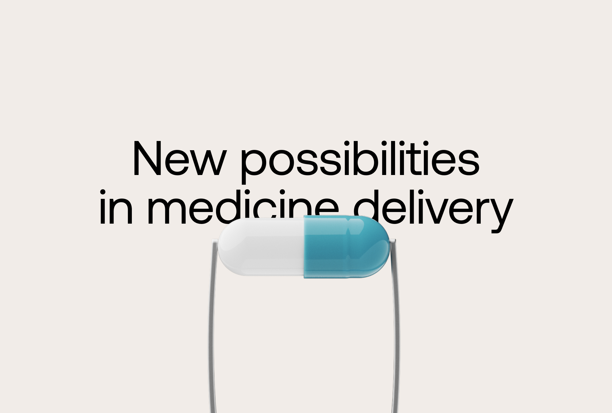
New possibilities in medicine delivery
Nortiva had built something genuinely rare — a single-dose oral platform that replaces a week of daily pills. The challenge was making that science feel as precise and inevitable as it actually is, without falling into the visual language of traditional pharma.
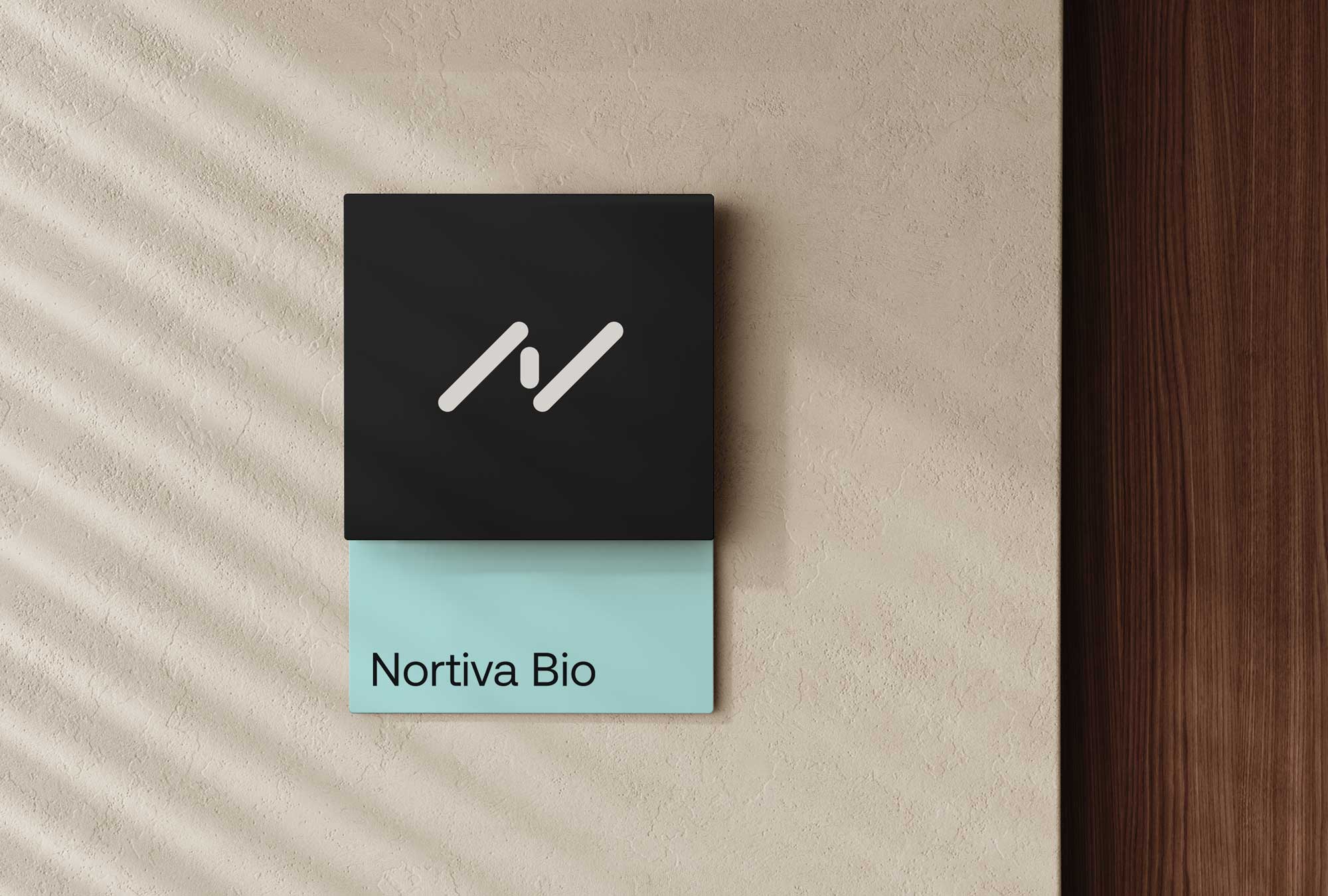
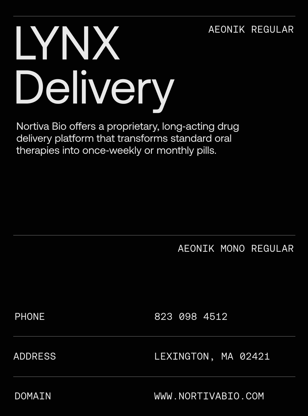
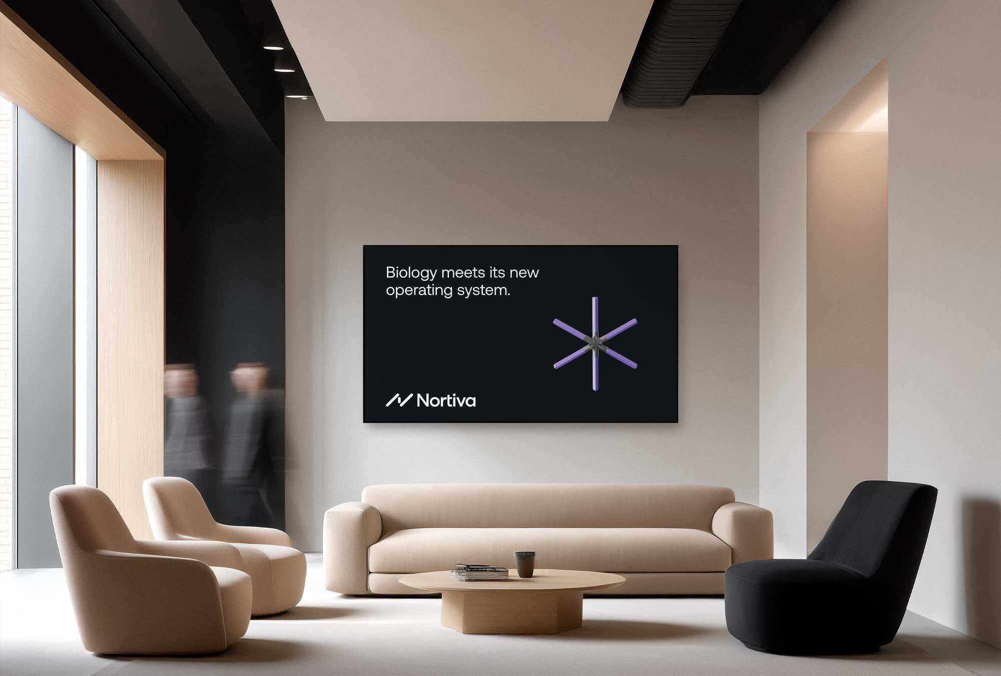
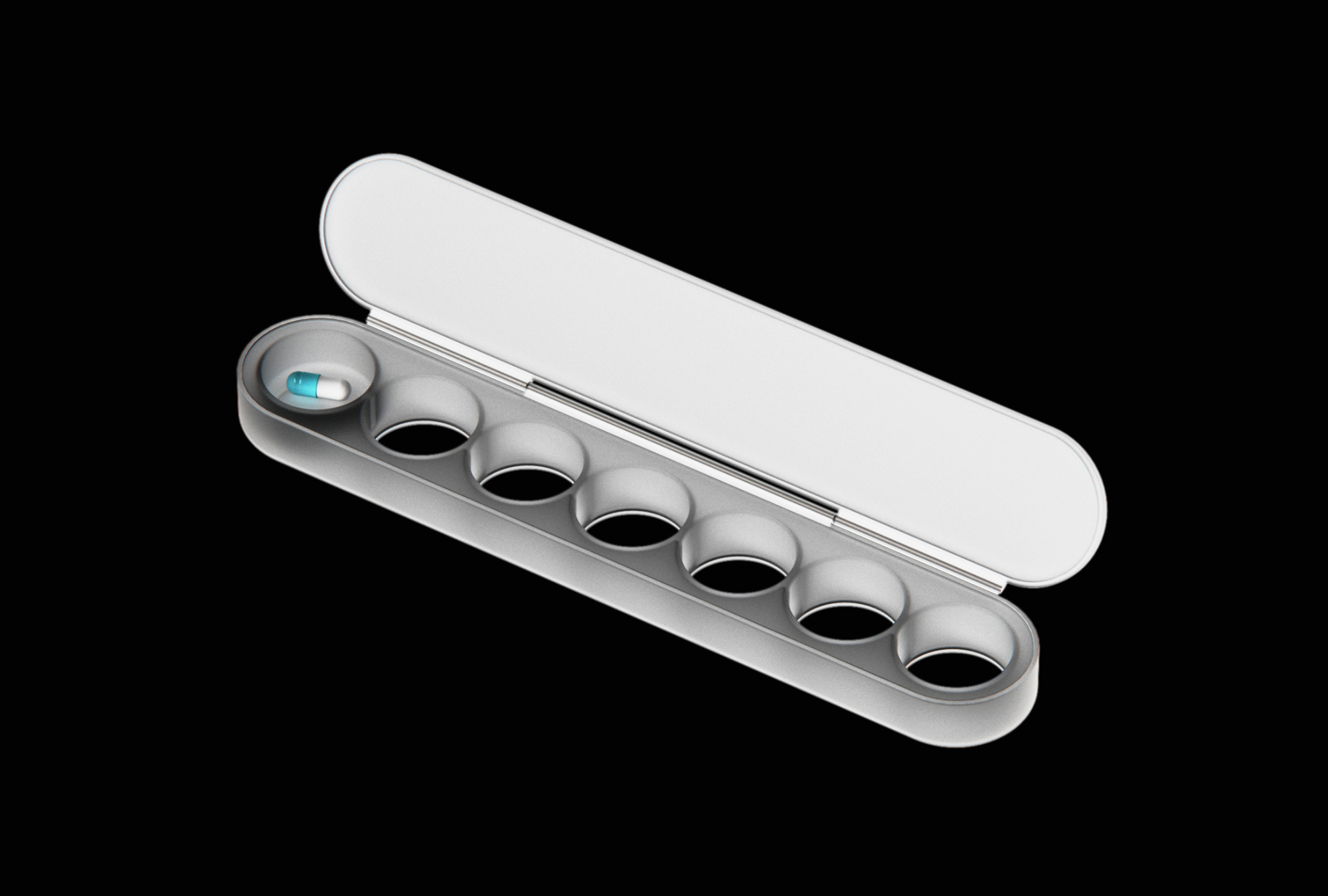
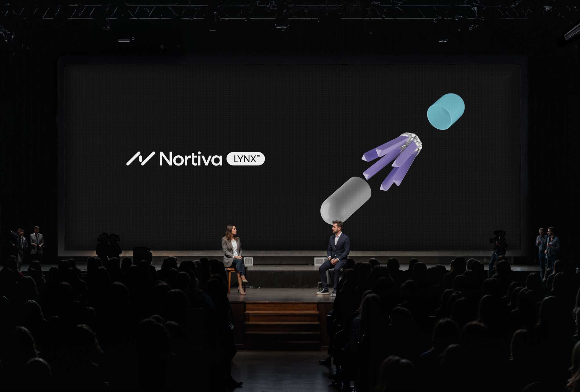
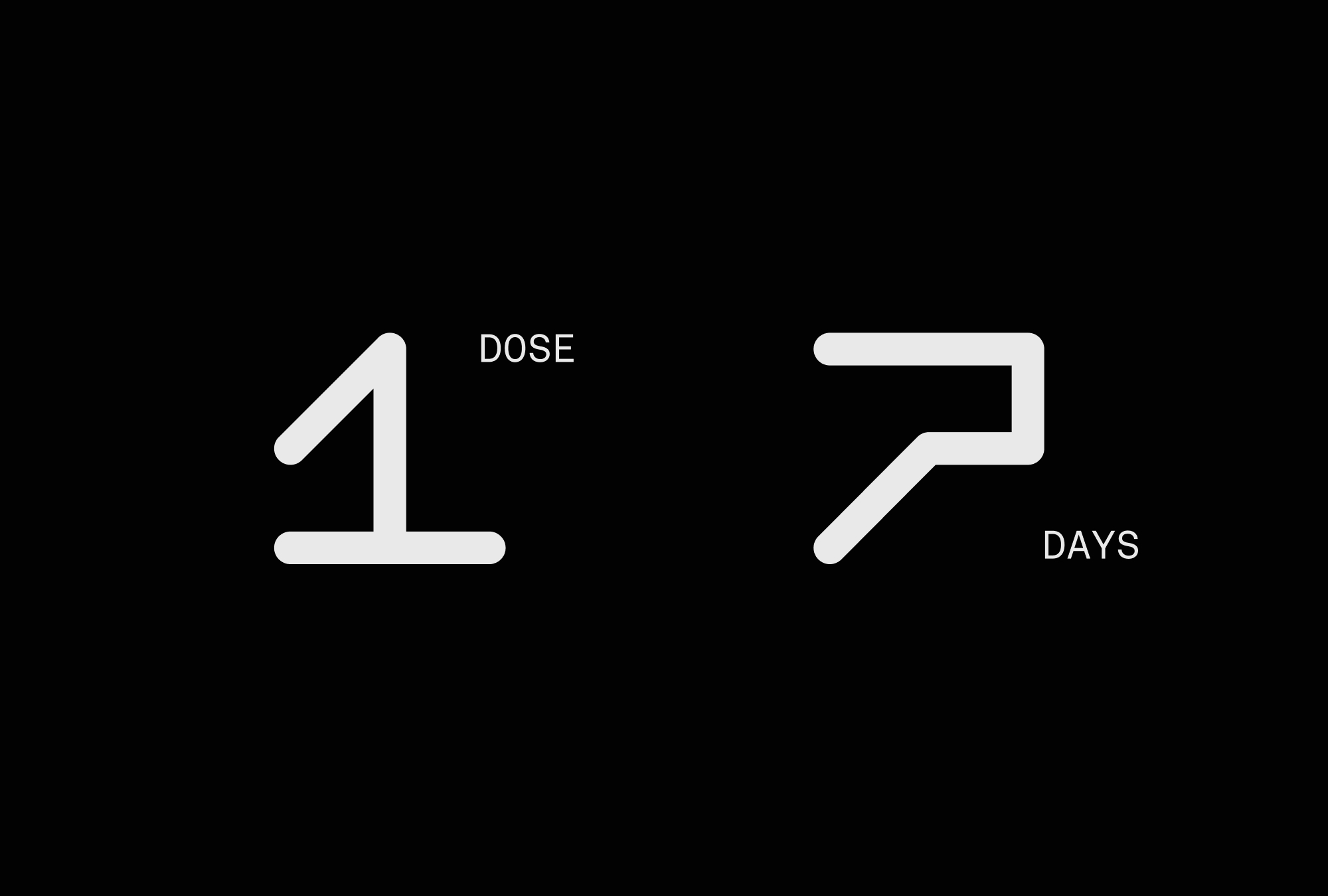
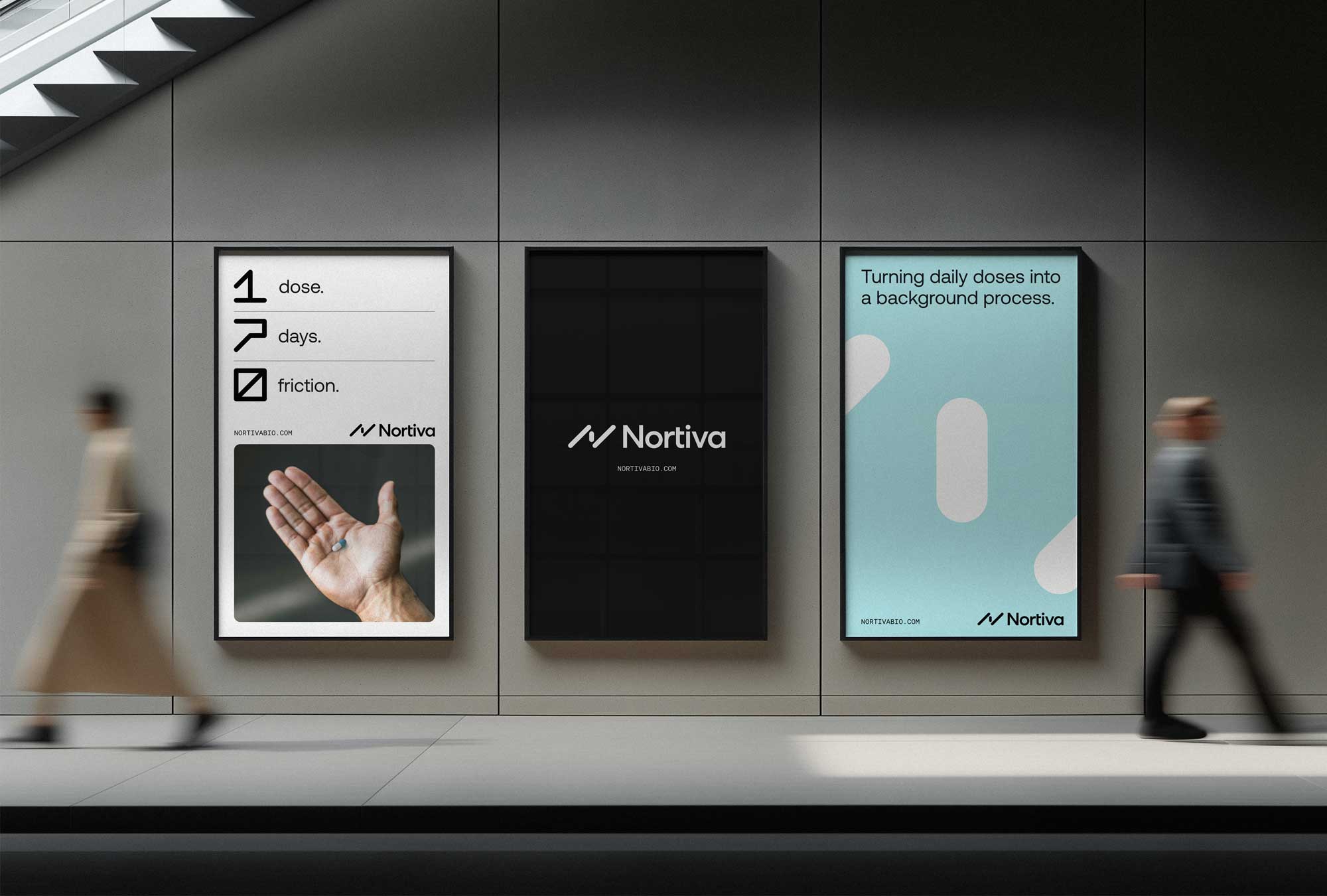
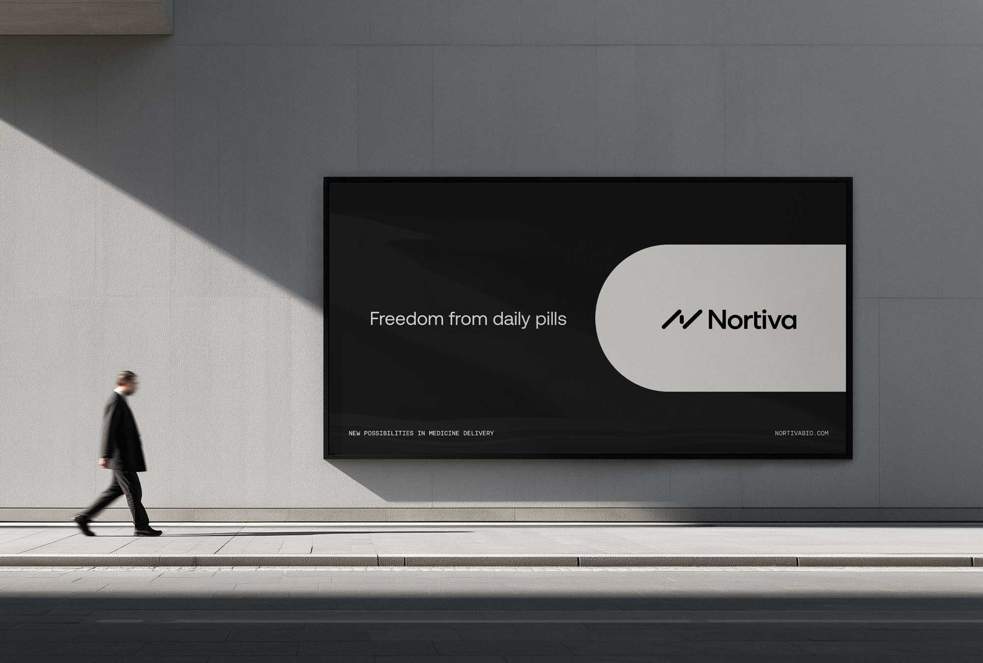
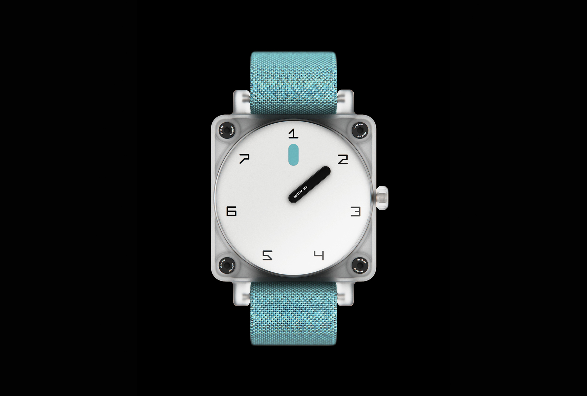
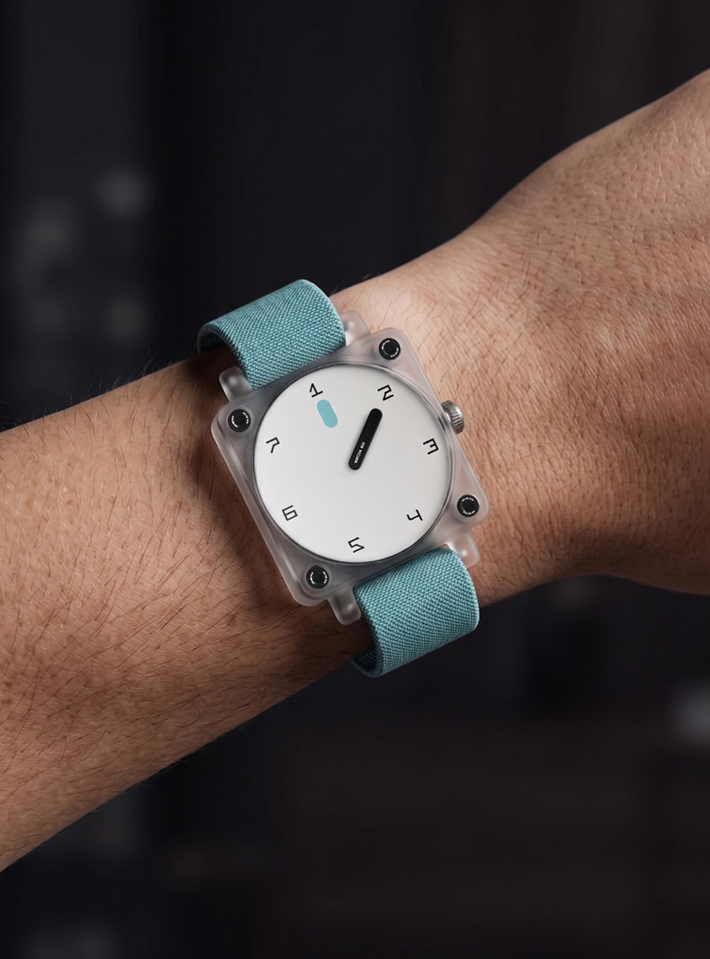
We found the insight in the repositioning: this wasn't just a rebrand, it was a rename. Moving from Lyndra to Nortiva signalled a fundamental shift in how the company understood itself — not a drug company, but an engineering company solving biological problems. Everything we built — from the symbol and wordmark to the identity around LYNX™ to a conceptual pill container and wrist timer reinforcing the one dose, seven day promise — treated precision and autonomy as the design brief. The result is a brand that feels like a technology company that happens to be changing how the world manages chronic conditions.
(Done in collaboration with ORCHESTRA)